Open shelves in kitchens became a huge hit. Whether the shelves are an integral part of the kitchen or subsequently added, this element will make every kitchen interesting and special in some way.
If you fill them with dishes, spices, decorations and a variety of other details it can be very functional and useful, and it will certainly raise the aesthetic look of your kitchen. There are usually three ways of filling them up – minimalist, crowded shelves or a combination of both. In other words, people often use approach “less is more” by placing a few well-chosen items. Then, there are those who take up complete functional approach, putting all sorts of things on their open shelves, or those who combine this approaches by grouping items on the shelves.
Get inspired with our examples and enjoy looking at variety of options.
Source
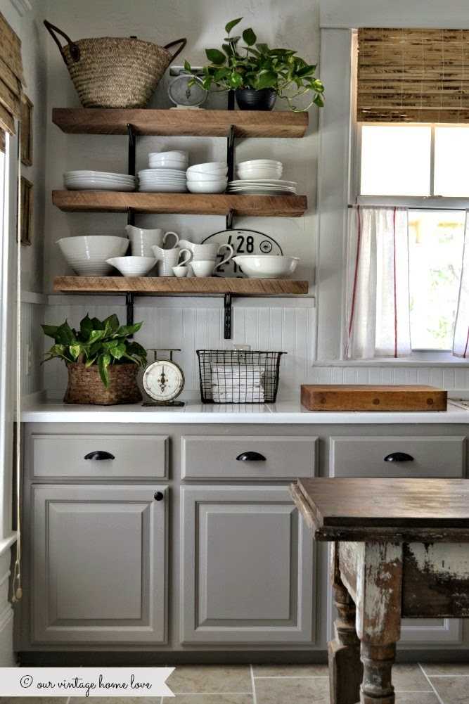
Wooden rustic shelves are going to fit in no matter what style is your kitchen. In this example filling them with chosen white dishes and few plants gives them clean fresh look. If your kitchen is in some style without rustic wooden areas, be sure to add some other item made of wood to match the shelves.
Source
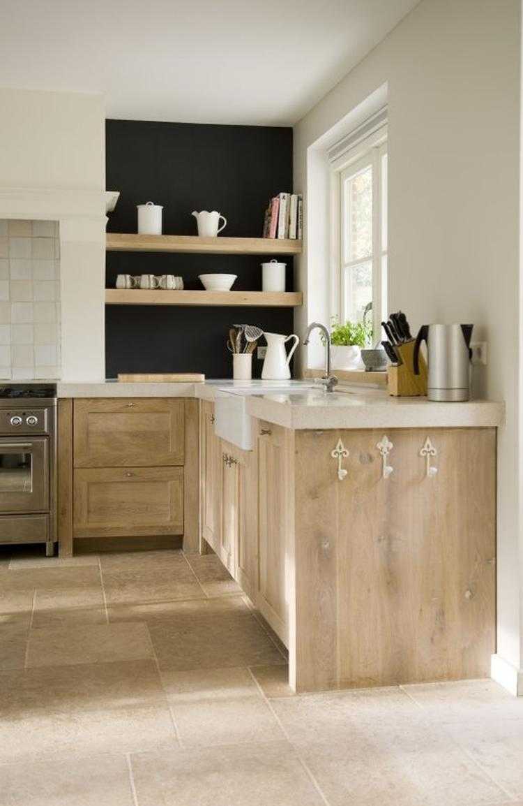
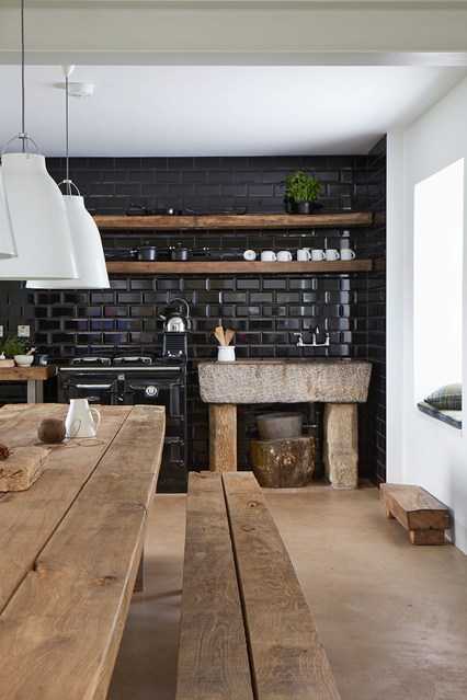
Three colors combination that is timeless and that will fit in with any design style. White dishes on a black wall stands out and the wood gives the needed warmth. Only two shelves and couple of sculptural dishes is great example how “less is more” should function.
Source
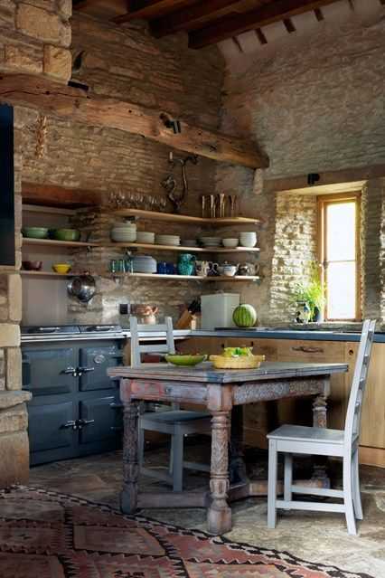
Open shelves filled with dishes adds even more details to this completely rustic chic design. Wood and brick give the warmth and a couple of small bright colored dishes break the monotony of natural color scheme.
Source
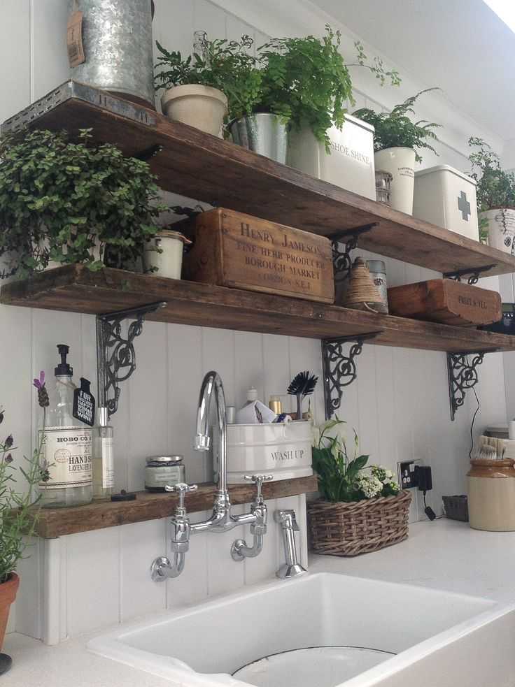
If keeping the dishes out in the open is not your kind of thing, you can use open shelves to accommodate indoor plants and spices. White, green and wood is another combination that is always stylish.
Source
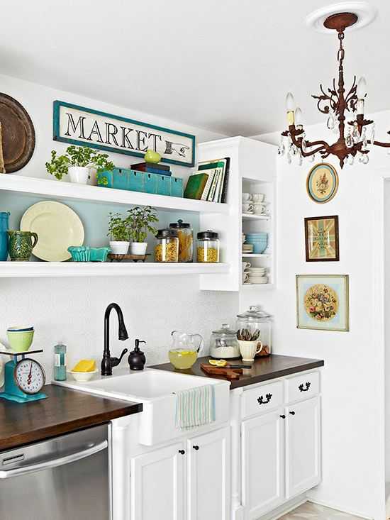
Completely white kitchen, including the open shelves is a great ambient for colorful details that really stand out. The great thing about this choice is that by changing content of your shelves you change color scheme of your kitchen.
Source
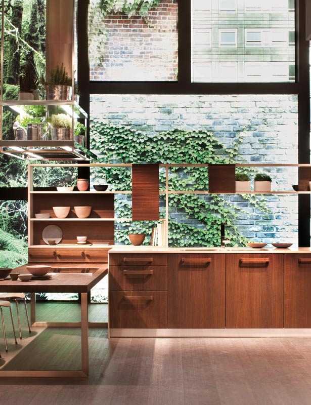
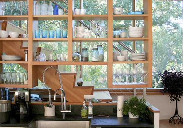
Openness is the word that describes this kitchen the best. Due to large window areas the boundary between inside and outside is almost invisible, while shelves without backside accent that feeling even more.
Source
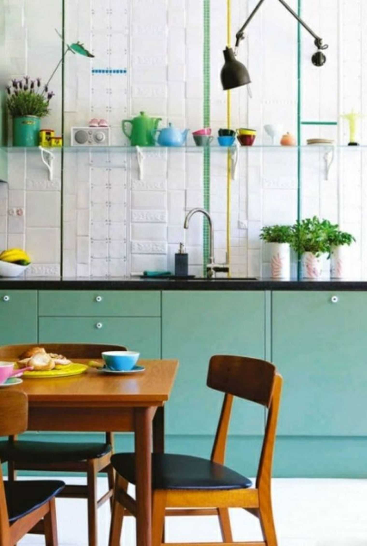
Before seeing this photo when someone would say glass shelves in the kitchen, many would probably say – no way. However looking at this kitchen industrial design many would change their mind. Great interpolation of white sculptural wall with colorful details and retro furniture.
Source
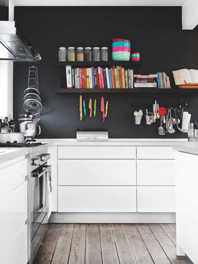
Another timeless white and black combination but this time instead of wood, monochromatic composition is broken by variety of small colorful details. Strong colors of book covers, bowls and knifes gives cheerful note to otherwise cold combination.
Source
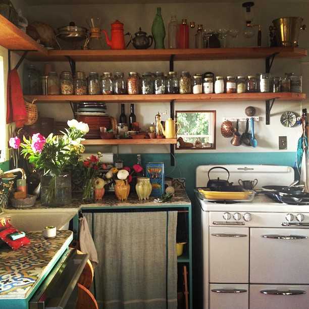
Here we have functional approach we been telling you about at the beginning of the article. This bohemian style kitchen maybe does not have best design qualities, but it has soul and it looks like kitchen that someone uses a lot, with lot of love.
Source
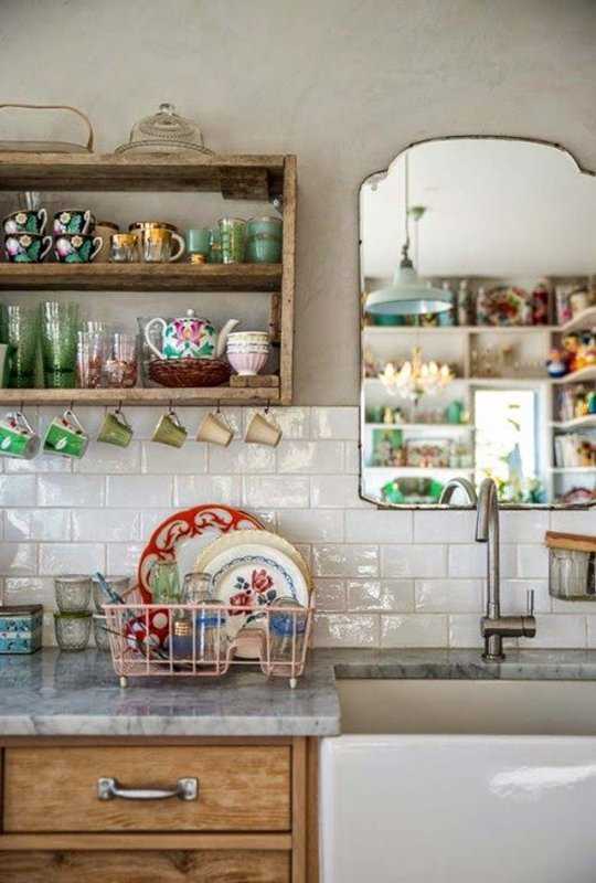
Another retro, bohemian styled kitchen. A relatively simple kitchen design is compensated with large amount of diverse details. This kind of dish collection is something you built throughout years, so this look is not something you can get at once.
Source
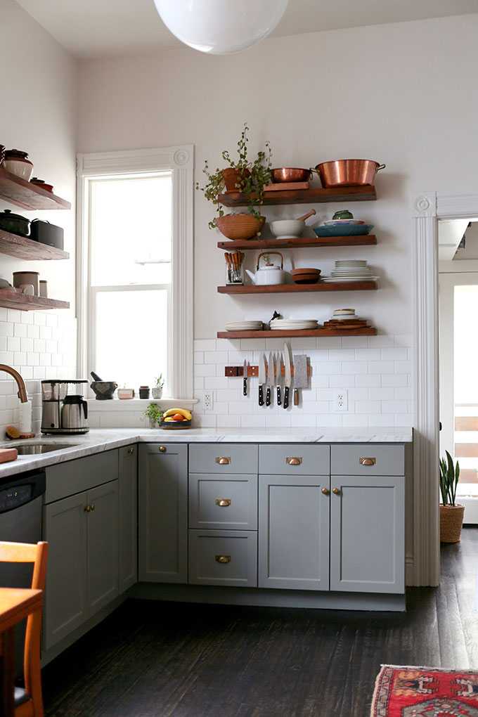
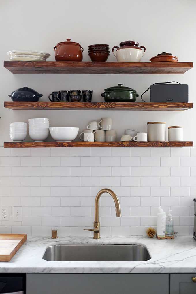
Very clean design for small apartment kitchens. Open shelves and thoughtfully chosen dishes for display look neat but also like items that are being used daily.
Source
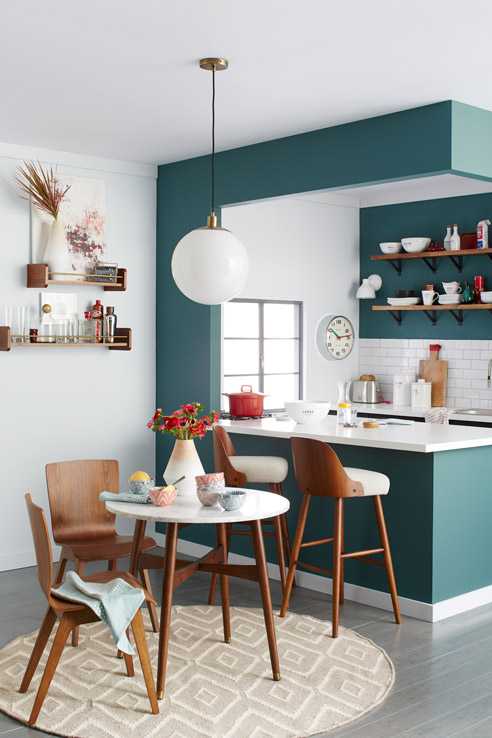
Example of very stylish small apartment kitchen design. Blue color visually detaches kitchen form the rest of the room, while open shelves and their content , both in the kitchen and in the eating area, add details that breaks the uniformity of the design.
Source
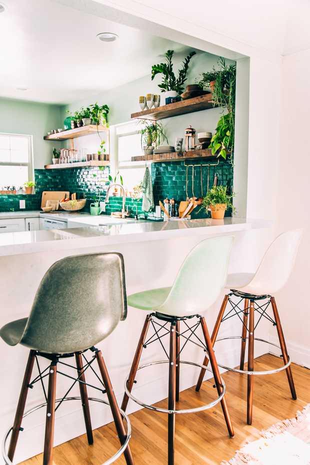
Open shelves can be used as a place for your indoor garden. Green tiles and a lot of plants give this kitchen fresh nature vibe.
Source
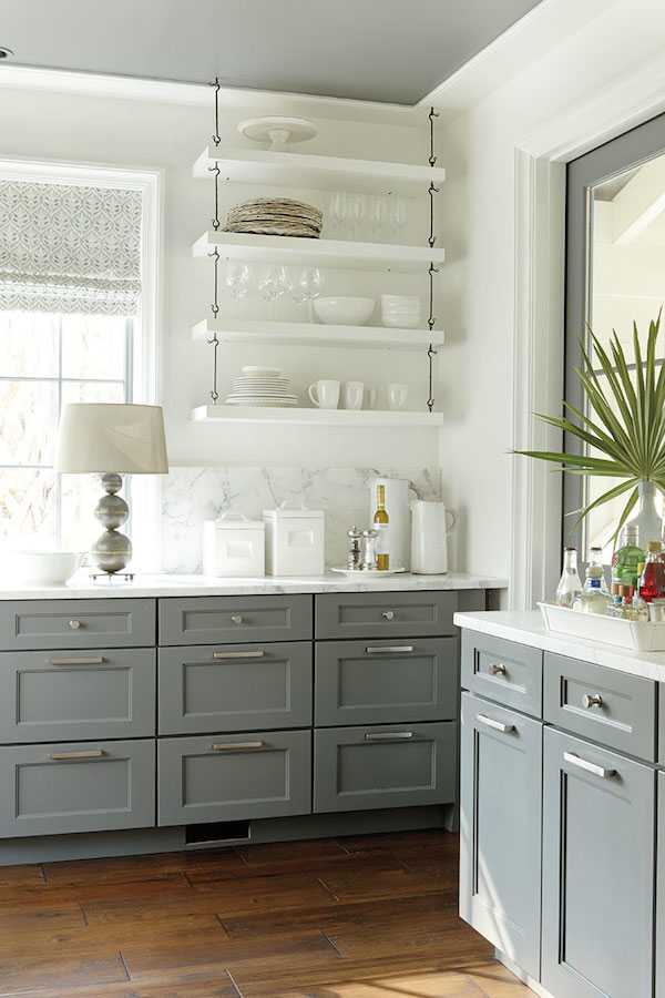
White shelves on a white background filled with white dishes look very neutral and clean. A lot of natural light emphasize that even more.
Source
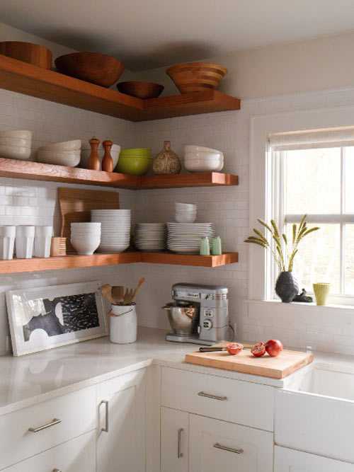
In this example completely white kitchen was enriched with cornered wooden shelves. Carefully stacked dishes does not seems overcrowded even though there is a lot of it. Framed art and vase with flowers look very decorative and soothing.
Source
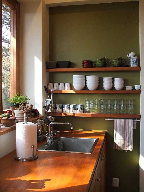
Wood and olive green color always look good, especially if you are going for warm Mediterranean look. Dishes grouped into stacks and deployed by colors and materials looks very neat.
Source
Open shelves can be space divider as in the example shown above. They let the light trough but still visually divide kitchen from stairway.
Source
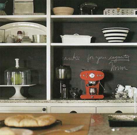
Black chalkboard paint on the wall behind shelves gives great background for white shelves and bright color items, while it also represents great place for leaving messages, writing down recipes or for creative outbursts when you feel inspired.
Source
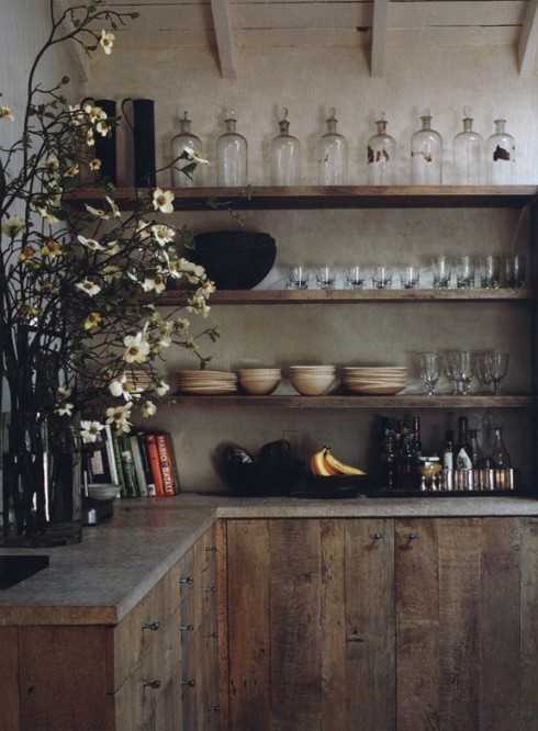
Rustic cabinets and matching shelves combined with flower bouquet gives the impression that the kitchen is part of the cozy bungalow somewhere in the mountains. Off-white wall blends with raw wood softening the whole ambient.
Source
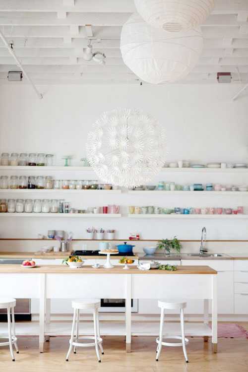
White kitchen, ceiling, shelves, lightening, chairs and soft pastel details on the shelves makes whole composition romantic. Although it looks more adequate for taking pictures than for actual cooking.
Source
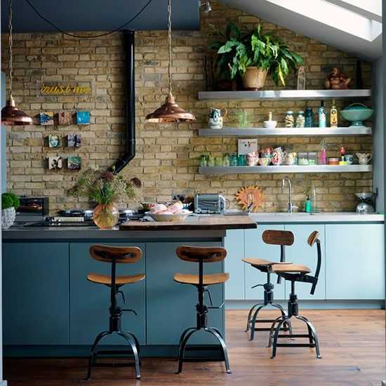
Industrial design at its best. Shelves along with plant fit perfectly in the composition. No detail is to much.
Source
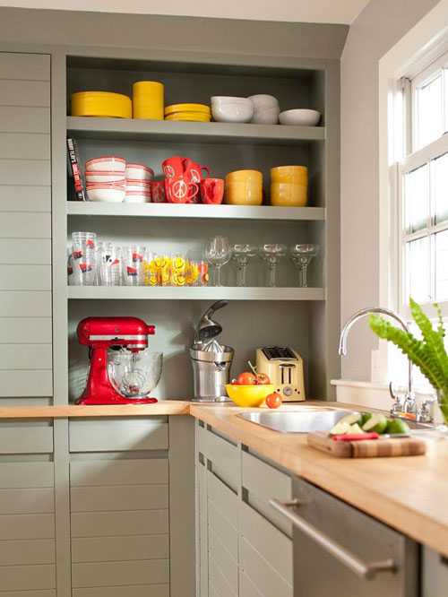
Totally neutral kitchen, revived with bright yellow and red color. Plant and vegetables also gives the very needed freshness to the whole composition.
Source
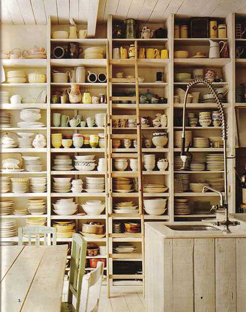
This seems as dish and pottery collector kitchen, but still it looks amazing. There is a lot of details but the color scheme is neutral so it does not look messy or crowded.
Source
A combination of rustic and modern design. Very bold and unusual composition. Black tiles are not usual choice for kitchen and the kitchen sink speaks for itself.

